The branding of the graduate exhibitions at HIT-Holon Institute of Technology and Bezalel Academy of Arts and Design comprised three languages: whereas the name of the exhibition at Bezalel was the name of the academy translated or transliterated into the three languages, in the case of HIT the name of the exhibition, “Salon Kayitz” (Summer Salon) was translated into French (Salon D’été) and Arabic. In terms of hierarchy, the three languages are listed with French at the top, Hebrew in the middle, and Arabic on the bottom. In terms of size, the Arabic and French are of identical size and color, whereas the Hebrew appears in a considerably larger sans serif font.
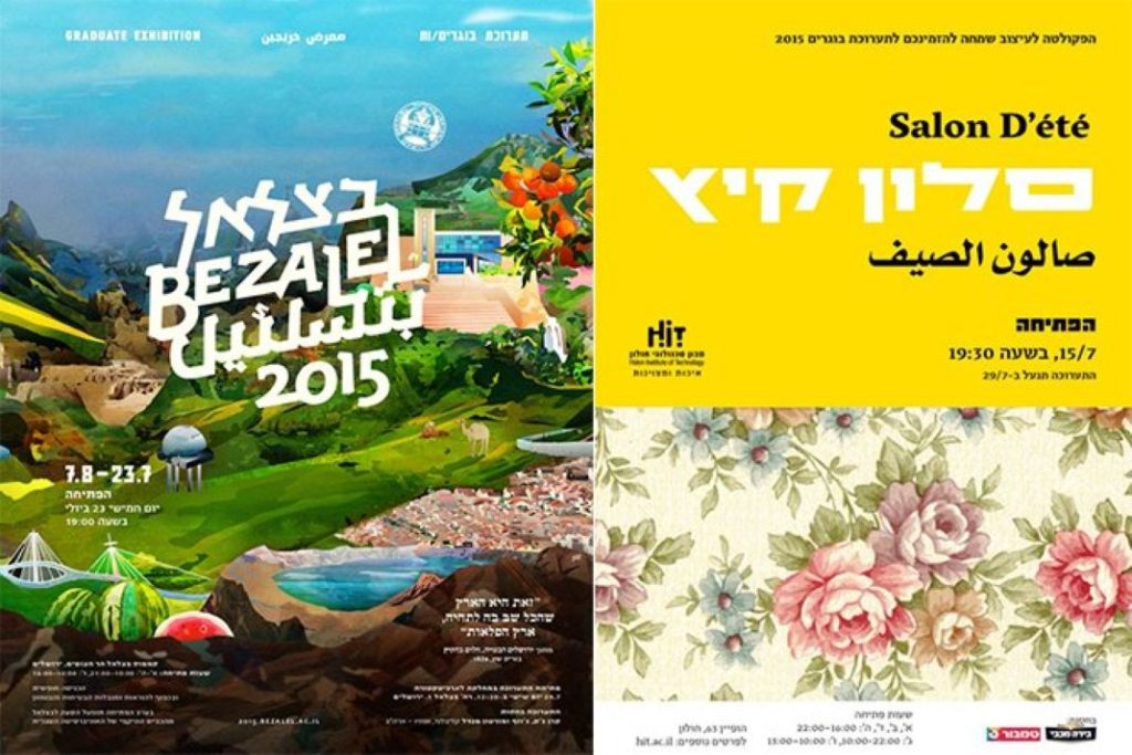
The use of Arabic in a national sphere such as Israel, in a pedagogic sphere such as a school or academy, and in a creative and investigative sphere such as design, in which there is a close connection between content and form, should attest to the content of the exhibition. The choice of the name seemingly echoes the French Salon des Refusés in 1863 – the art exhibition that presented the works of avant-garde artists that were rejected by the Salon de Paris. The addition of the “provocative” Arabic to this historical reference seemingly promises a kickass, avant-garde exhibition.
However, closer scrutiny of the announcement reveals that information such as the type of exhibition (a graduate exhibition), its location, opening and closing dates, and opening times, appear only in Hebrew. And in the exhibition itself, the Arabic is absent from the outset, the explanations accompanying the projects and the direction signs to the various departments are all written only in Hebrew.
Inconsistent and selective translation, partial or absence of information are not an uncommon phenomenon in a country in which, according to the Ethnologue website, 37 dialects and languages exist side by side. While Hebrew and Arabic are the official languages in Israel by law, they are not equal in status, and this begs the questions: What role does Arabic play in a place where there is no expectation that it will be read? When and in which context do the students choose to use it? What does it represent? What is the power or weakness in its presence, absence, or disguise?
48, Magazine Series, the graduate project by Nawal Arafat from the Department of Visual Communication at Shenkar College of Engineering, Design, and Art, confronts the Hebrew-speaking reader with this issue of presence and absence. By means of curating, editing, and design, the project, comprising seven magazines consisting of texts on the identity of Palestinian-Arabs who hold a blue (Israeli) ID card, reflects the relationship between Hebrew and Arabic as both text and a visual metaphor.
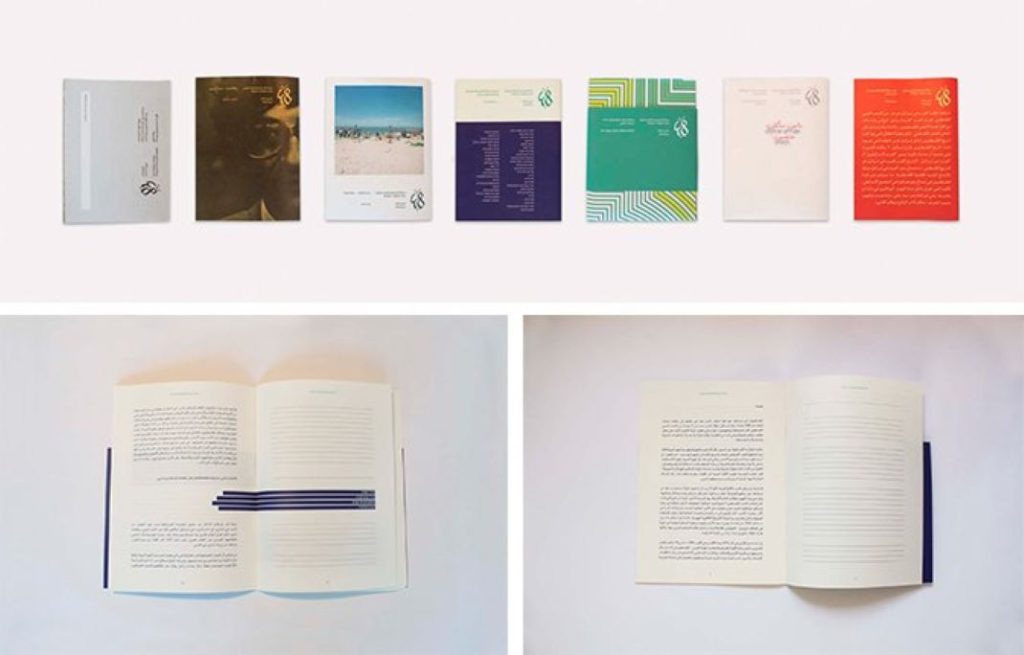
Particularly thought-provoking is the magazine featuring an article in Arabic without a full translation into Hebrew. Arafat takes the issue a step further by choosing for us what will be translated and emphasized in accordance with her personal outlook. It is the Hebrew that becomes “present-absent”, a term commonly employed in the Arab-Israeli discourse, and thus she turns the Hebrew-speaking reader into a stranger in his own home.
Visits to the graduate exhibitions over the years reveal that Arabic is customarily cast in a number of roles: The first chooses to primarily address the form of Arabic script. The branding of the graduate exhibition at HIT clarifies that the choice of the term “salon” denotes “living room” [Hebrew: salon], a personal space that seeks to invite visitors to an intimate encounter with the graduates and the subjects with which they engage. Considering the wide range of characteristics Arabic can represent, in this instance it is neither a compliment nor an attempt to appeal to other Arabic-speaking audiences, otherwise the announcement would have been translated in full. The chosen characteristic was the warmth and oriental flavor Arabic script conveys by virtue of its calligraphy, probably in order to strengthen the living room and warm hospitality motif.
The second casting of Arabic usually indicates inequality, locates it in a position of inferiority, and at times even attempts to lead to rectification. Last year, for example, it was Abraham Font by Daniel Grumer (Bezalel 2014) who observed that in their design road signs embody the power relations between Jews and Arabs, and chose to create from the outset two fonts, Hebrew and Arabic, possessing identical visual characteristics.
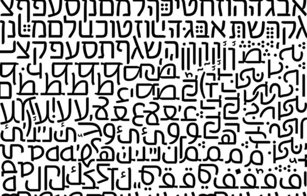
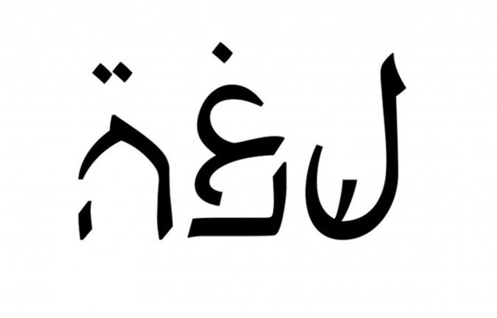
Alongside the realistic, solution-providing projects, we find projects that create a utopian framework for themselves and enable presentation of optimistic scenarios of hope and peace. Arabic seemingly becomes a society of equal status and value, as evident in the typographic branding project Let There Be Peace / Essel Industrial Zone, a utopian industrial zone in a reality of peace, by Tamar Moshinsky from the Department of Visual Communication at Bezalel. ‘The name, Essel’, Moshinsky explains, ‘originates from the Hebrew and refers to the pole used to balance two buckets of water being carried from the well’. And indeed, evident in all the components of the project are many and varied solutions that attempt to preserve the balance between the two languages. On the stamp, for example, the Arabic sometimes appears first and at others second in the hierarchy. A quote from Albert Camus that bears relevance to the project, ‘Don’t walk behind me; I may not lead. Don’t walk in front of me; I may not follow. Just walk beside me and be my friend’, is written alternately in Arabic and Hebrew, but the first in the hierarchy is Hebrew – fortunately both languages are written from right to left. The sign at the entrance to the industrial zone splits the familiar welcome greetings, “Bruchim Haba’im” in Hebrew and “Ahlan Wasahlan” in Arabic, and creates an unconvincing hybrid of “Bruchim Wasahlan” and “Ahlan Haba’im”.

This year, Moshinsky’s optimistic approach is balanced by Typoccupation by Bentzi Binder from the Department of Visual Communication at HIT, which discusses the influences of an occupying culture on an occupied culture, and demonstrates this influence typographically.
It is interesting to examine the project beginning with its name; the choice of the term “occupation” for a project that discusses the relationship between Hebrew and Arabic is confusing, and some would argue even misleading. Occupation/conquest, be it of the land, the wilderness, and first and foremost the “enlightened occupation”, are collocations identified with the Israeli Left, and are usually employed in the framework of the debate on Israel’s governance over the Palestinians in the territories that were occupied/conquered/restored/retaken/returned (circle the correct option in your view) during the Six-Day War. It might have been expected that the project would present the influence of Hebrew on other scripts, but the project presents a reverse scenario whereby the Hebrew letters are subject to the influence of three cultures: Ethiopian, North Korean, and Arabic – and in a more focused way, under the occupation of ISIS.
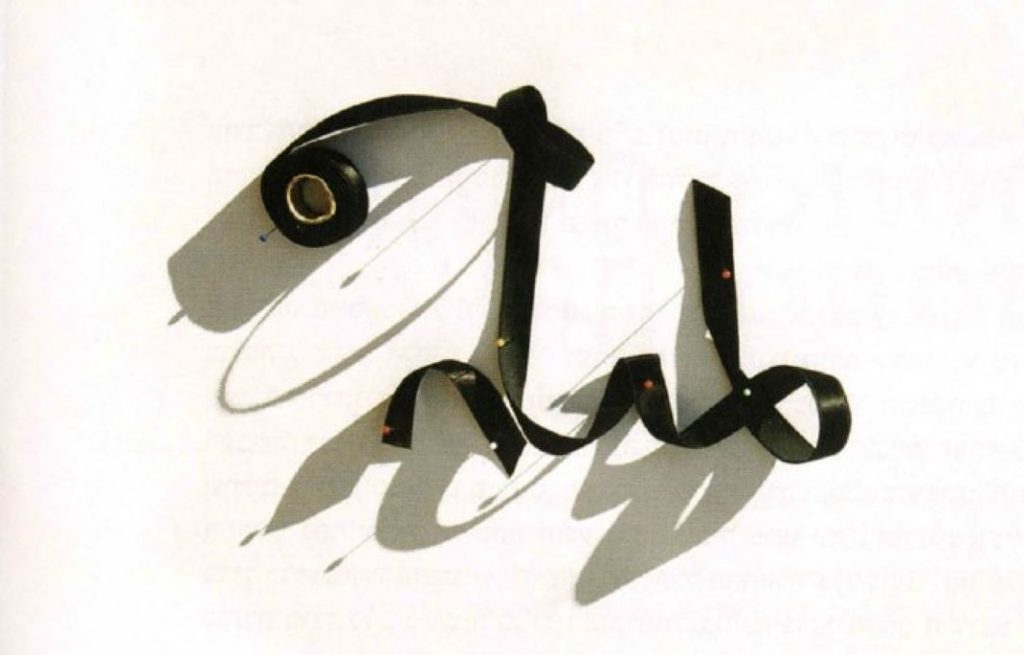
In contrast with past typographical projects that combined Hebrew and Arabic, and in their presentation emphasized the quality of the newly designed system of letters, such as The Cursive Project by Michal Vexler (Bezalel 2005), Arabrew by Liron Lavi Turkenich (Shenkar 2012), and Abraham Font by Daniel Grumer (Bezalel 2013), in Binder’s project the new letters are already active, and he presents them in a series of short films documenting the writing (an action that in today’s computerized era we will soon be able to include in the museum’s collection of extinct human activities). The fact that the Mediterranean song “Eizo Medina” (What a Country) accompanies the act of writing makes the viewer think about the internal ethnic struggles in Israel, not necessarily the external threat of occupation by ISIS.
At this stage there are no clear and binding official criteria for the graduate projects in the various departments of visual communication. If all the students were obliged to include several languages in their projects, whatever the subject or format, not necessarily Hebrew, English, and Arabic, but also the languages of other groups in the population, such as Russian or Amharic, the students would have to contend with complex multilingual systems. Then they would have to make decisions concerning hierarchies, positioning, and readings, and take into consideration the cultural background that each language brings with it – a subject that is learned in degree studies as part of the typography classes, and a task the students are highly likely to encounter when they enter the labor market.
Beyond providing a uniform criterion for examining and judging the projects, in the case of Arabic the inclusion of additional languages will enable its release from the restricting label attached to it that references the political or national struggle; thus it will be possible to see it in a wide range of additional contexts and subjects, as with the multiple subjects Hebrew discusses: music, food, sexual identity, sport, health, education, and who knows – perhaps even love.
