The Design Lab is hosting Oded Ezer, a graphic designer, typographer, and senior lecturer at HIT, who will be leading a Hebrew typography workshop for third-year students
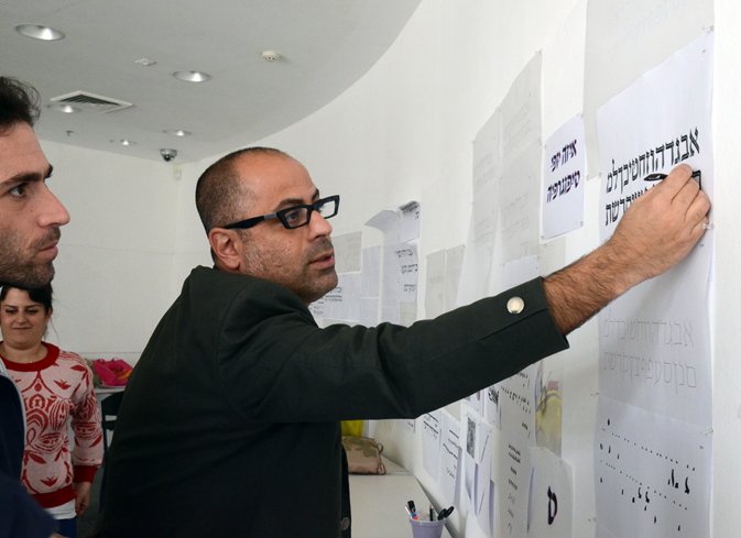
The Design Lab at Design Museum Holon is hosting Oded Ezer, a graphic designer, typographer, and senior lecturer at Holon Institute of Technology (HIT), who will be leading a Hebrew typography workshop for third-year students from HIT’s Department of Visual Communications. The workshop will provide the students with tools for original typographic creation based on the principles of the Hebrew letter.
Introduction / Post 1 / Post 2 / Post 3
04.03.13 – The Skeletons Take a Turn, and How Do We Communicate What We’ve Learned?
Refining the Skeleton
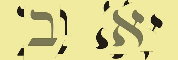
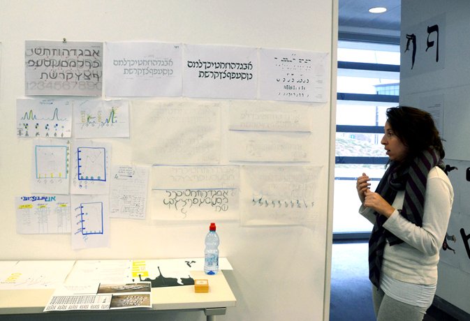
We went over the skeleton extraction assignment to clarify exactly what a skeleton is. The skeleton extends to the middle of the letter, it doesn’t have to look like a letter, but traces it precisely in its center. When you do it by hand, it’s very easy to be accurate, whereas in the shift to digitizing attention must be paid to changing curves that consequently create a new skeleton that isn’t faithful to the original.
A skeleton is not a root. The ‘root’ of the letter is the concept of the letter as a whole. Take the Hebrew letter Aleph as an example: its root is a diagonal line with two additional lines intersecting it.
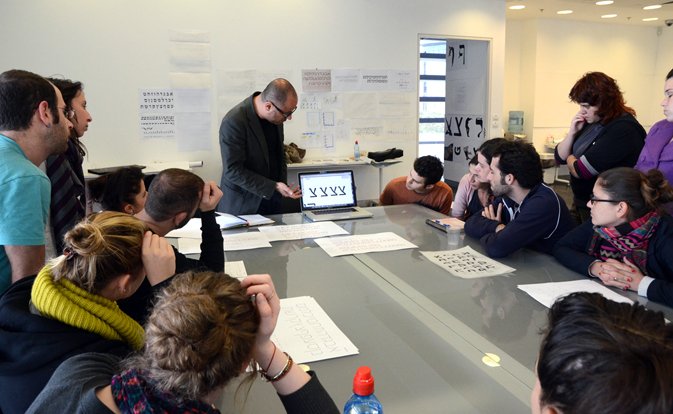
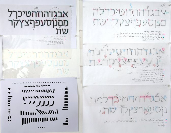
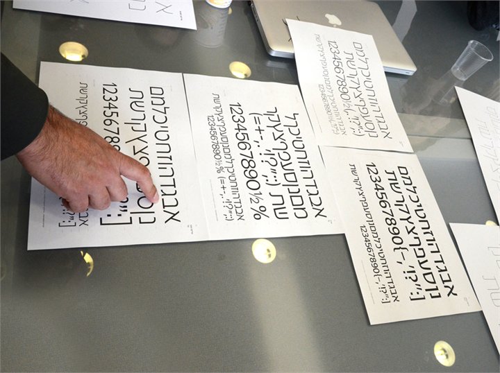
The Skeletons Take a TurnNow that we’ve understood what a skeleton is, we can start playing with it. Each student showed his modulation of the font he researched (the change is consistent in all the letters in the font in order to create a new skeleton which doesn’t yet exist, while maintaining the identity of the Hebrew letter). There were some interesting studies and several refreshing suggestions. We understood that the rules, the logic, have to be internalized, and then applied to all the letters.
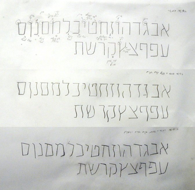
Evolution of a Skeleton – A Short History Lesson
Asher Oron designed the Oron font in the 1970s as an equivalent to the Latin Univers font. Oron’s skeletons are based on the Narkis Tam font, which has undergone straightening. Oron’s font modulations were carried out on the Hebrew letters Vav, Yod, and Nun-sofit, which had a curve added on their tip, and on Shin, in which the middle line was detached, thus creating the font’s distinctiveness.
Evident in the Erica Sans font (equivalent to the Latin Gill Sans), designed by Yanek Iontef, are the skeleton changes that led to the creation of a new font, and the style character was created by ‘truncating’ the letters.
In the End, Everything Has To CommunicateConcurrently with gaining an understanding of the letters, their components, and the beginning of making changes to them, the students presented sketches of their ideas for the project of teaching Museum visitors about the skeleton and style of letters.
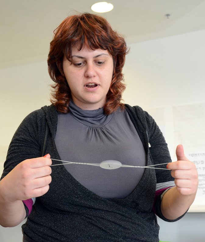
Daria proposed an idea based on the nostalgic ‘Bird in a Cage’ optical illusion: on one side of a piece of paper there is a picture of the skeleton of a letter, and on the other a font style, and rapidly spinning the piece of paper creates the optical illusion of a skeleton ‘dressed’ with style. We discussed how this could be presented in an interesting way to visitors, perhaps with the help of a video, or hanging up numerous pieces of paper for visitors to use and experience for themselves.
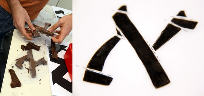
Asaf plans to make a huge letter from chocolate that will break according to style parts, and thus teach visitors what each part is. We talked about what the action creates, so that the activity will not merely amount to eating chocolate.
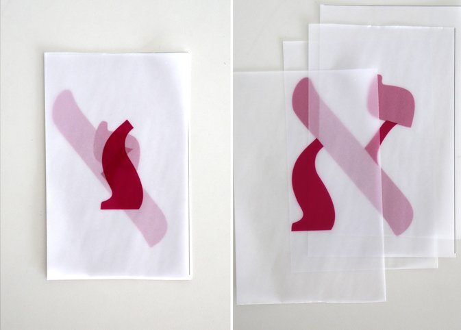
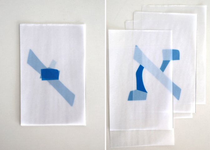
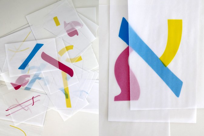
Paula has taken three fonts, which she has divided into parts according to style and skeleton, with each part presented on a transparency, and people can assemble their own letters and learn which style they’re using to do so. A question was raised of how to create something that visitors can take home as a souvenir of assembling letters. Perhaps look into using stamps or physical letter parts to make the experience more sensory.
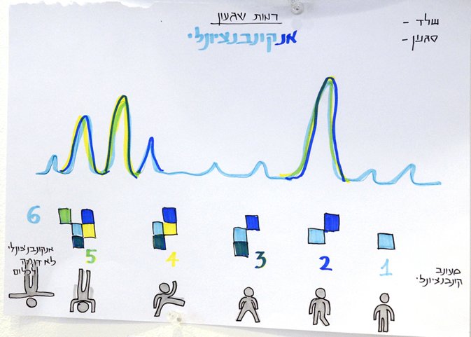
Maayan has started classifying the different fonts according to a conventionality scale. The more ‘zany’ the style/skeleton, the higher the score it receives. A discussion ensued in which we talked about ‘what is normal?’ In fact, everything is measured in relation to something that needs to be defined. We came to the conclusion that the argument is in the very assignment, in starting a discussion on what is normal and what is crazy.
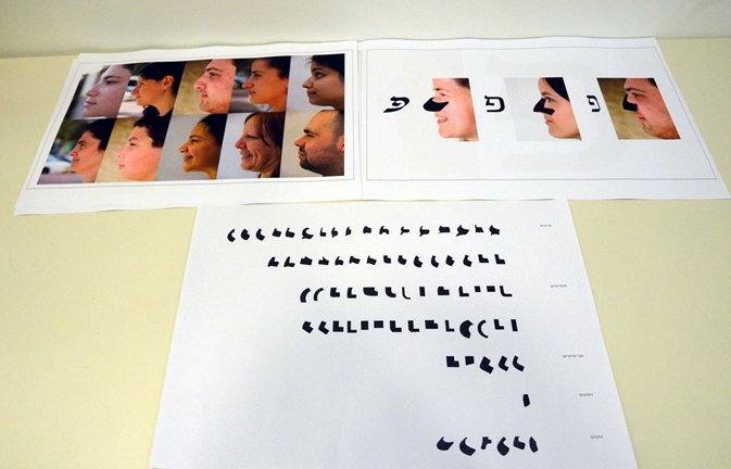
Maya proposed an idea based on the ‘Jewish nose’, namely pictures of people’s profiles, and matching each nose with a particular style.
What Next?For the next lesson each student will continue working on the modulations he has begun, and dress the new skeleton with the font style from which he embarked. He will also ‘dress’ the new skeleton with the style of a font that’s as dissimilar as possible to his original font.
Written and photographed by Michal Shani
Introduction / Post 1 / Post 2 / Post 3
